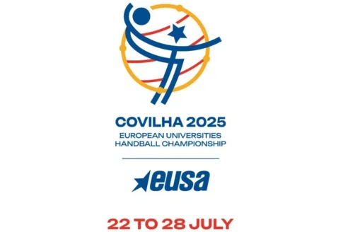
Handball European Championship Logo Celebrates Identity, Equality, and University Spirit

The official logo of the European Universities Handball Championship, set to take place this summer in Covilhã, has been revealed. More than just a graphic symbol, the logo was thoughtfully designed to embody the identity of the host city, the fundamental values of university sports, and the European spirit of the event.
Blending tradition, modernity, and inclusion, the design incorporates five key elements, each rich in symbolic meaning.
The ball of wool pays homage to Covilhã’s industrial heritage, particularly its historical association with the textile industry. It highlights the city’s legacy while also reflecting its ability to innovate and evolve, preserving its deep-rooted traditions.
Another prominent element is the armillary sphere, inspired by the Portuguese national flag. This iconic symbol evokes Portugal’s maritime history and its pivotal role during the Age of Discoveries. Within the context of the championship, it represents the event’s international scope and the spirit of exploration and cultural exchange.
The star holds a central place in the visual composition, simultaneously referencing the Serra da Estrela mountain range, the city of Covilhã, the University of Beira Interior, and the European Union. It serves as a unifying symbol, connecting local, national, and European identities.
Also featured is the mirrored figure of a handball player, symbolising gender equality and the balance between the men’s and women’s competitions. The handball itself completes the design, standing as the universal icon of the sport at the heart of this championship.
Rather than serving solely as a symbol for the event, the logo was designed to capture and express the shared values of unity, dedication, and ambition.
A presentation video, offering a behind-the-scenes look at the creative process, is now available on the championship’s official social media platforms.